Styles and Theming
UI components in the Gusto Embedded React SDK ship with some simple styles as a baseline which are also fully themable. Themable means that components are designed to be able to take on the look and feel of the application in which they live.
Setting up styles
The Gusto Embedded React SDK ships with preliminary styles for the UI components as a baseline. Those can be included by setting the following import:
import '@gusto/embedded-react-sdk/style.css'
Consumers typically apply this import at the application root where they are also setting up the GustoProvider.
Setting up themes
Themes are a collection of variables that determine how the styles applied to React SDK components will look. There are theme variables available for typography, inputs, buttons, and more. The React SDK ships with a basic default theme applied as a starting point, but it is anticipated that consumers will override theme variables to make the React SDK fit seamlessly into their application.
Where are themes set?
You can set the application theme by passing it as the theme prop to the GustoProvider component.
import { GustoProvider } from '@gusto/embedded-react-sdk'
import '@gusto/embedded-react-sdk/style.css'

const myCustomTheme = {
  colors: {
    success: {
      100: '#98FB98',
    },
  },
}

function MyApp({ children }) {
  return (
    <GustoProvider
      config={{
        baseUrl: `/myapp/`,
      }}
      theme={myCustomTheme}
    >
      {children}
    </GustoProvider>
  )
}
How are themes structured?
Themes are objects that contain style properties. The GTheme interface (viewable in the index.d.ts file in our published code on npm or navigable if you inspect the theme property on the GustoProvider using an IDE) defines the shape of the object and all of the supported style properties. Here is the root object shape at a glance:
interface GTheme {
  rootFS: string
  colors: GThemeColors
  focus: GThemeFocus
  shadow: GThemeShadow
  spacing: GThemeSpacing
  typography: GThemeTypography
  input: GThemeInput
  button: GThemeButton
  radio: GThemeRadio
  checkbox: GThemeCheckbox
  table: GThemeTable
  link: GThemeLink
  badge: GThemeBadge
}
Applying a custom theme
You can define custom themes with your own custom variables and pass them to the GustoProvider via the theme prop. The theme prop actually takes a GTheme deep partial, meaning you are able to selectively override only properties that you want. Observe the following:
import { GustoProvider, Employee } from '@gusto/embedded-react-sdk';
import "@gusto/embedded-react-sdk/style.css";

const myCustomTheme = {
  gray: {
    400: '#D4D4D4',
    600: '#737373',
    800: '#404040',
    1000: '#171717',
  },
  error: {
    800: '#991B1B',
  },
  warning: {
    800: '#92400E',
  },
  success: {
    400: '#4ADE80',
    800: '#166534',
  },
}


function MyApp({ companyId }) {
  return(
    <GustoProvider
      config={{
        baseUrl: `/myapp/`,
      }}
      theme={myCustomTheme}
    >
      <Employee.EmployeeList companyId={companyId} onEvent={() => {...}} />
    </GustoProvider>
  );
}
We didn’t specify all color values available. The ones we did set will apply to the SDK components as expected. For everything else we did not specify, it will leverage the values set in our default theme. This allows you to set customization only where needed instead of needing to override every property.
Global and component level theming
Some of the theme variables in the SDK have global implications while others have component level implications. Global theme variables are variables that get leveraged across components such as colors, spacing, and typography. Component level variables define the variables for a specific UI element such as a button or badge.
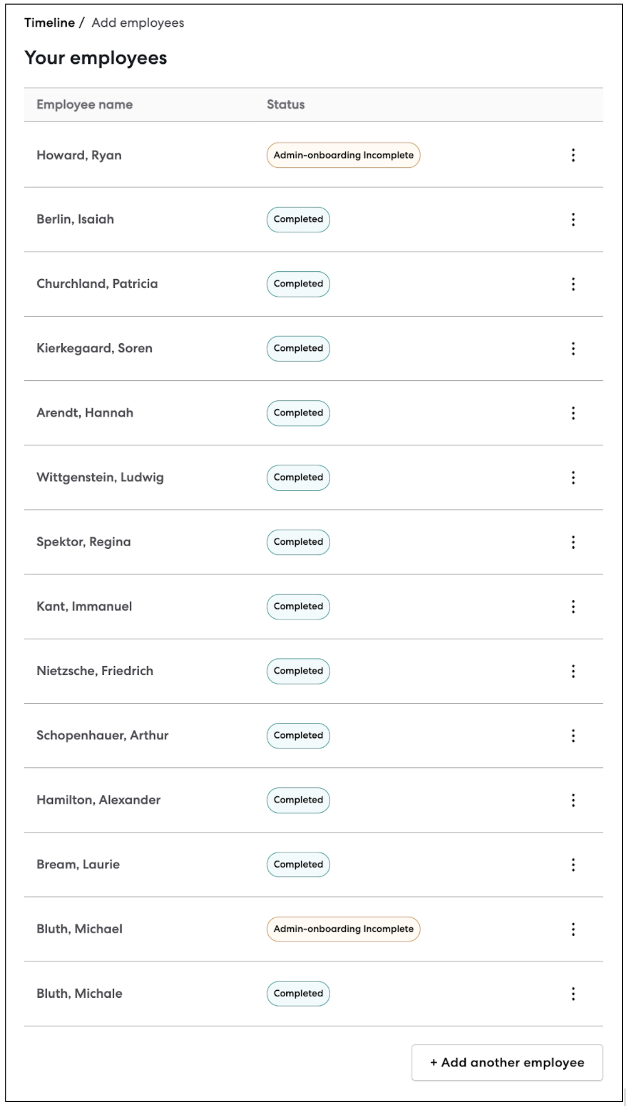
In practice that means we can update all our UI components by updating the global level variables. For example, here is a table that contains badges and buttons.

If we set our own theme variables for the colors and typography, it will change the look of these components.
import { GustoProvider, Employee } from '@gusto/embedded-react-sdk';
import "@gusto/embedded-react-sdk/style.css";

const myCustomTheme = {
  colors: {
    gray: {
      100: '#E6F3FF',
      200: '#CCE7FF',
      300: '#99CEFF',
      400: '#66B5FF',
      500: '#339CFF',
      600: '#0083FF',
      700: '#0066CC',
    },
    warning: {
      100: '#FFE4B5',
      500: '#FFA500',
      700: '#FF8C00',
      800: '#FF7F50',
    },
    success: {
      100: '#98FB98',
      400: '#90EE90',
      500: '#3CB371',
      800: '#2E8B57',
    },
  },
  typography: {
    font: 'Georgia, serif',
  },
}


function MyApp({ companyId }) {
  return(
    <GustoProvider
      config={{
        baseUrl: `/myapp/`,
      }}
      theme={myCustomTheme}
    >
      <Employee.EmployeeList companyId={companyId} onEvent={() => {...}} />
    </GustoProvider>
  );
}
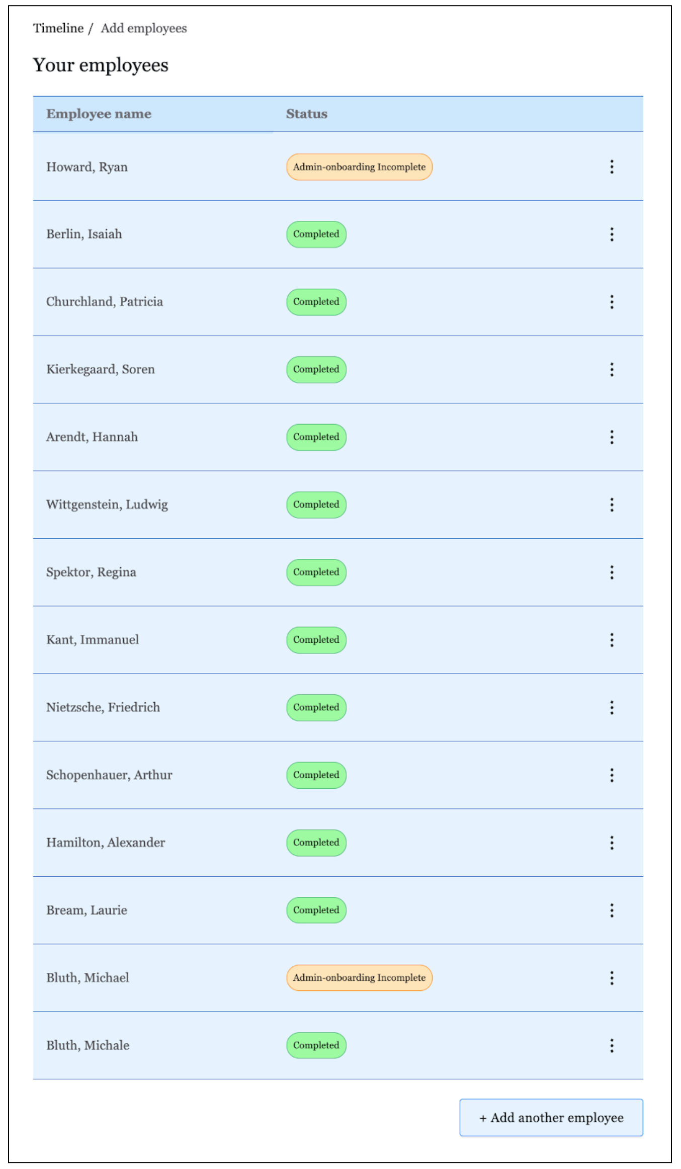
The resulting UI would be:

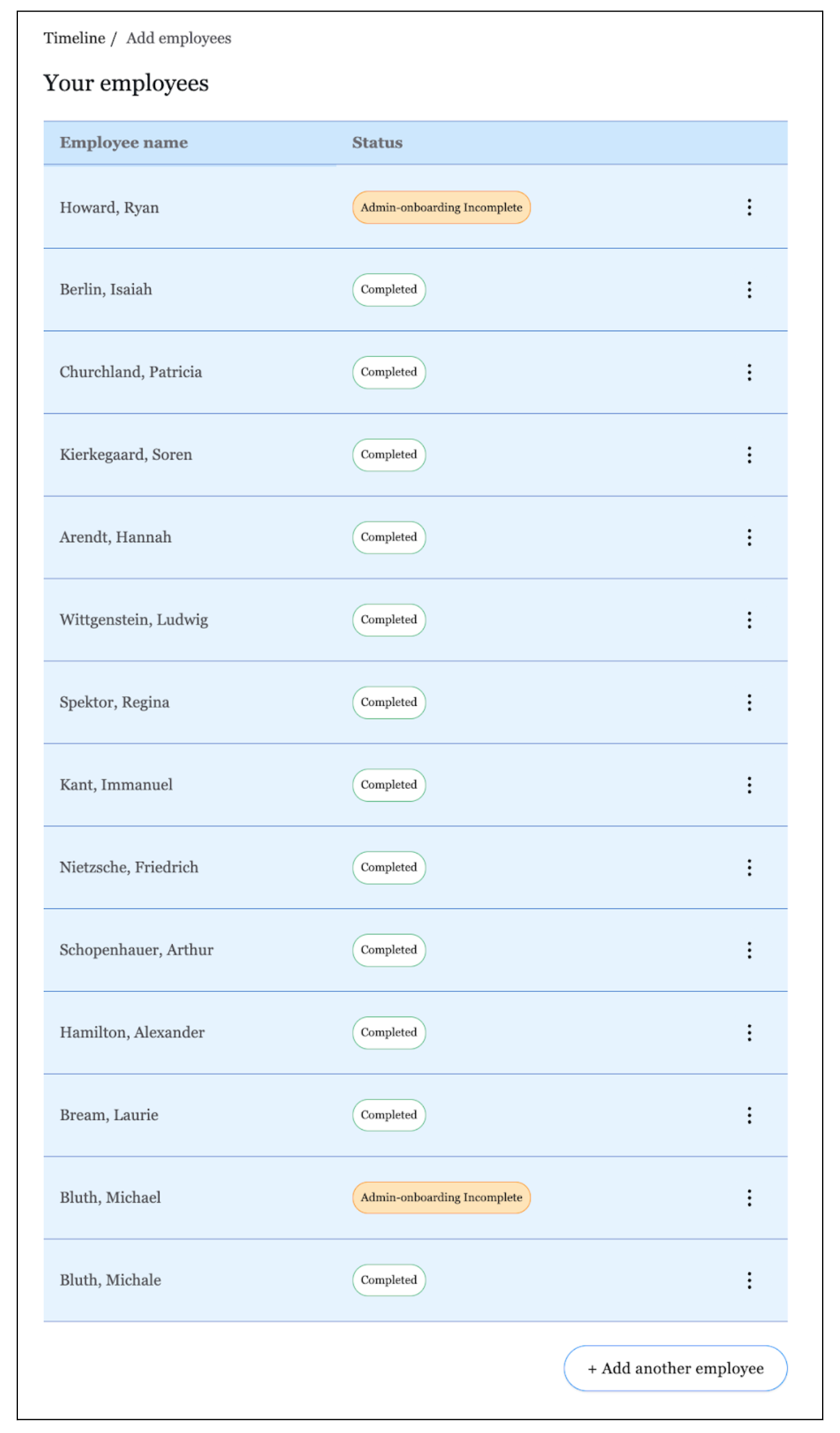
Observe how the table, badges, and button all updated based on changing the core color palette and typography. If we need further customization, we can update variables at the component level to fine tune. In the following code, we set component level overrides for button and badge:
import { GustoProvider, Employee } from '@gusto/embedded-react-sdk';
import "@gusto/embedded-react-sdk/style.css";

const myCustomTheme = {
  colors: {
   gray: {
      100: '#E6F3FF',
      200: '#CCE7FF',
      300: '#99CEFF',
      400: '#66B5FF',
      500: '#339CFF',
      600: '#0083FF',
      700: '#0066CC',
    },
    warning: {
      100: '#FFE4B5',
      500: '#FFA500',
      700: '#FF8C00',
      800: '#FF7F50',
    },
    success: {
      100: '#98FB98',
      400: '#90EE90',
      500: '#3CB371',
      800: '#2E8B57',
    },
  },
  typography: {
    font: 'Georgia, serif',
  },
  badge: {
    success: {
      backgroundColor: '#FFFFFF',
    },
  },
  button: {
    secondary: {
      bg: '#FFFFFF',
    },
    borderRadius: '999rem',
  },
}


function MyApp({ companyId }) {
  return(
    <GustoProvider
      config={{
        baseUrl: `/myapp/`,
      }}
      theme={myCustomTheme}
    >
      <Employee.EmployeeList companyId={companyId} onEvent={() => {...}} />
    </GustoProvider>
  );
}

Button and badge are now updated to reflect the component level theme variables.
Using global and component level styles together, you have the control you need to make the React SDK match your application.
Using rem Units for Styling
The Gusto React SDK primarily utilizes rem units for styling. This approach allows for flexible sizing of SDK components based on the font size set on the HTML root element of your application.
Dynamic Sizing
By adjusting the font size of the HTML root in your application, you can easily change the size of all SDK components. For example, if you set the root font size to 20px, all components using rem units will scale accordingly.
Customizing rem Units
You can also customize the base size used for rem calculations by updating the rootFS variable in your theme. By default, rem units are calculated using a base size of 16 pixels.
For instance, if you want to set a new base size, you can do so like this:
import { GustoProvider, Employee } from '@gusto/embedded-react-sdk';
import "@gusto/embedded-react-sdk/style.css";

const myCustomTheme = {
  rootFS: '24' // This sets the base size for rem calculations
}


function MyApp({ companyId }) {
  return(
    <GustoProvider
      config={{
        baseUrl: `/myapp/`,
      }}
      theme={myCustomTheme}
    >
      <Employee.EmployeeList companyId={companyId} onEvent={() => {...}} />
    </GustoProvider>
  );
}
In this example, by setting rootFS to 24, all rem calculations will now be based on this new value. So, if a component is styled with 1rem, it will equal 24 pixels instead of the default 16 pixels.
Updated 27 days ago